User Feedback Informs RSNA’s Innovative Website Redesign
Visitors to RSNA.org should know they played a significant role in the comprehensive redesign of the highly traveled portal.
RSNA began the three-year project by soliciting feedback from a wide range of website users and stakeholders to find out what functions and features they most desire from RSNA.org. Along with extensive research data, RSNA used that feedback as a blueprint for redesigning the look, feel and functionality of the website that was unveiled in October 2018.
RSNA interviewed website users representing different ages, career experience levels, nationalities, practice settings and specialties to learn how they use RSNA.org and how it fit — or didn’t fit — into their workflow. RSNA also conducted an online survey asking members about frequency of use, access to content areas and ease of use. Internally, a wide strata of staff members was interviewed to guide the process.
Along with a dynamic appearance spotlighting rich, colorful images, the redesign focused on key areas including navigation, intuitiveness and mobile friendliness.
To make it easier for users to find the information they need quickly and in as few clicks as possible, RSNA updated/consolidated content, created a new organizational structure and developed a new navigation menu.
Highlights of the redesign include:
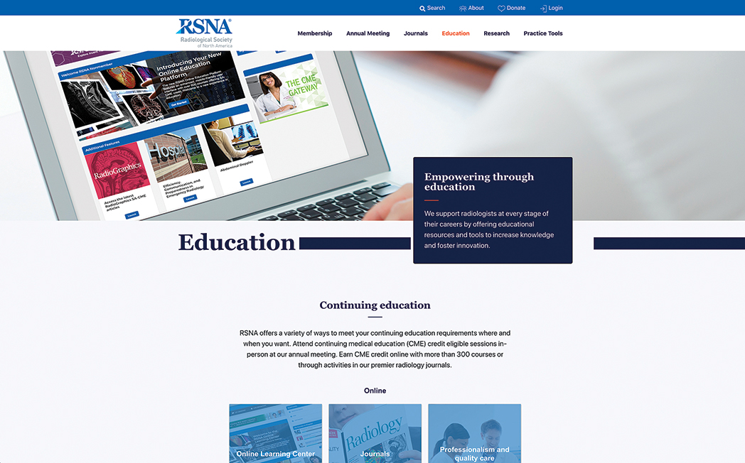
- All educational opportunities are now grouped into one Education category (CME-eligible and non-CME-eligible educational content).
- Research tools and grants/awards that were previously located on the RSNA Research & Education (R&E) Foundation page are now located in one new Research category.
- A new Abstract Submissions page offers year-round information on submitting abstracts.
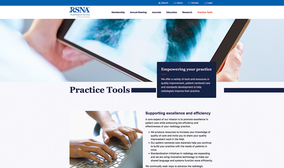
- A Practice Tools section was added, showcasing valuable resources in a single location. Users can access RSNA’s full library of resources in three categories:
- Quality Improvement: Reports and resources
- Data Tools and Standards: Structured reporting, Radiology lexicon, Image Share and Integrating the Healthcare Enterprise (IHE).
- Patient-centered Care: Communication toolkit, Patient-centered care learning set and Reading list.
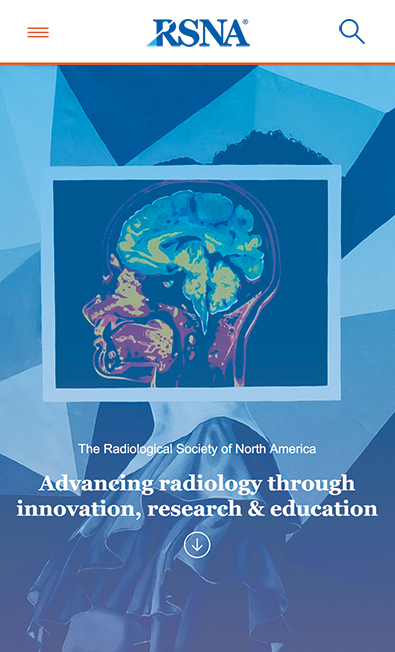
- Featuring more robust wayfinding and a special menu for mobile devices, the updated mobile design is as accessible, functional and intuitive as the desktop version of RSNA.org.
RSNA.org Evolves with Users
While RSNA has enhanced the user experience, the website remains a central hub for radiology education, research and innovation, providing a wealth of resources to guide radiologists and allied professionals throughout their careers.
Built for expansion, the website will evolve as RSNA continues to evaluate members’ changing needs and incorporate your feedback.
RSNA leaders are at the forefront of a forward-thinking vision for the Society and the website is designed to reflect that viewpoint.
“RSNA is always looking forward and our website should demonstrate that,” said RSNA Executive Director Mark G. Watson. “We invite you to explore the new RSNA.org and share your feedback with us.”


